ASH Analytics- Viewing Activity Combinations
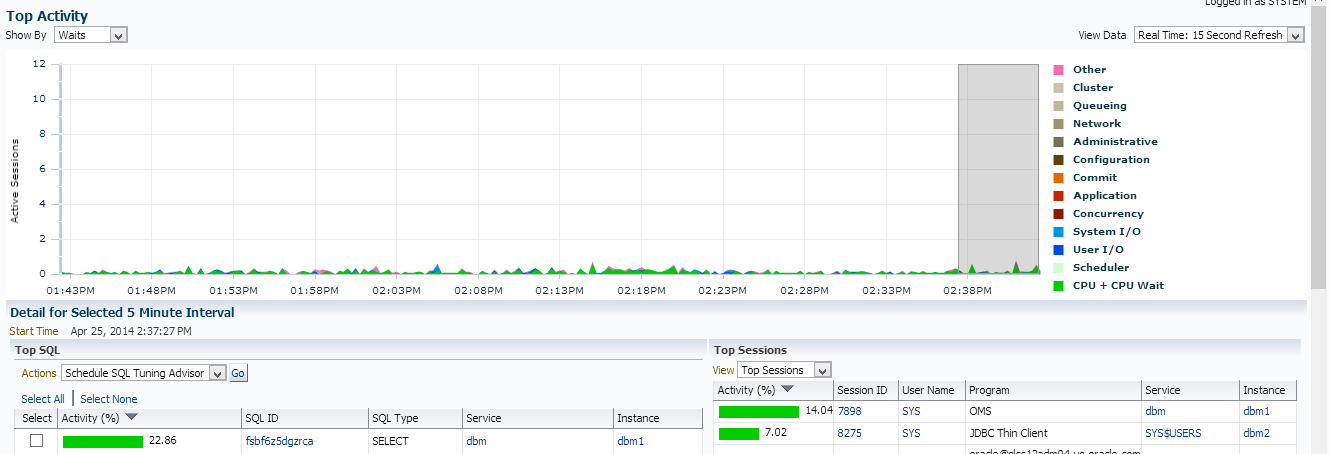
When working with Top Activity, we’re accustomed to viewing to wait class in the top, graphed area and below left, the top SQL by SQL_ID and below right is our Top Session information. ASH Analytics was designed so you would enter into a view that looked very similar to Top Activity, but was enhanced so the user could update it to view the data in multiple ways.
In Enterprise Manager’s traditional view of Top Activity, it is easy to recognize the similarities with ASH Analytics but that’s where much of it stops. The user has the ability to change not just the top graph to view data in multiple ways, but it can be combined with the left and right tables that by default, display the top SQL and Top Session to comprise more complex results in ASH Analytics- much more so than it’s predecessor ever could.
So here’s Top Activity:
Vs. Traditional View in ASH Analytics
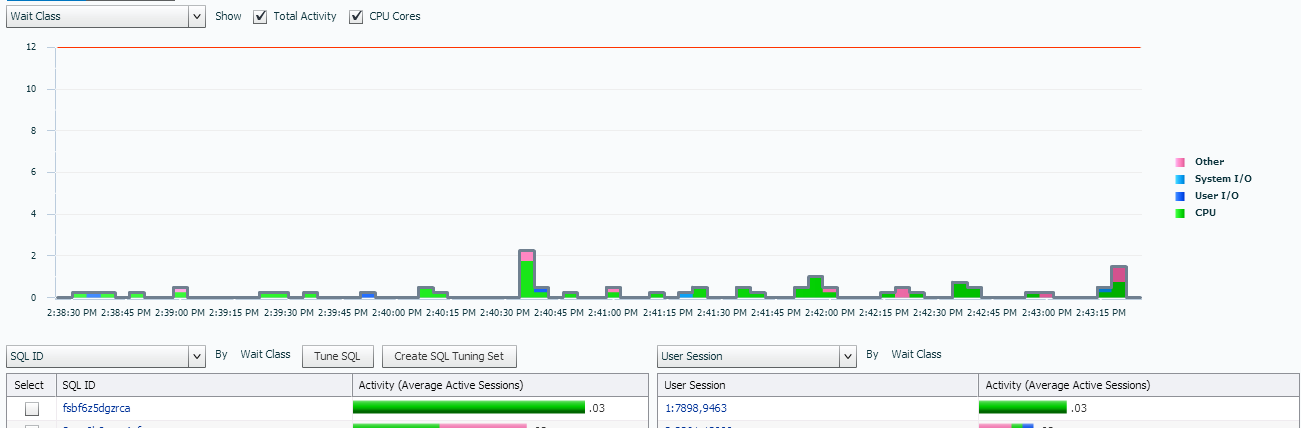
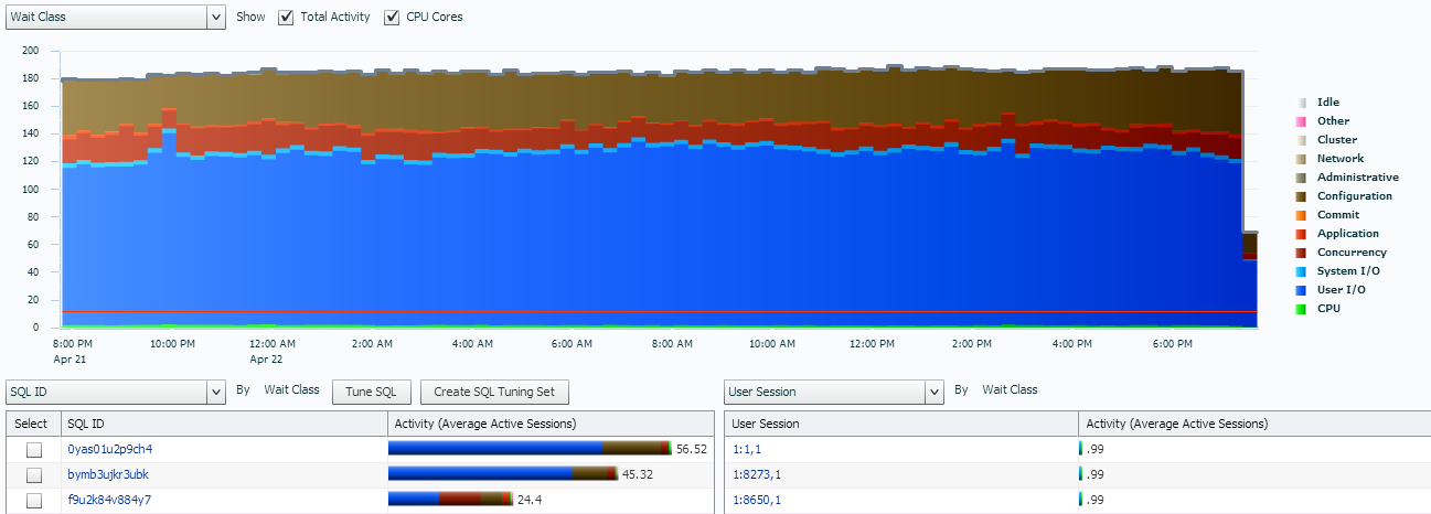
If we move to a historical view with ASH Analytics where there is a heavy workload, we see all our wait events graphed out for us and our tables below, just as expected:
Now let’s view that SAME data as a load map:
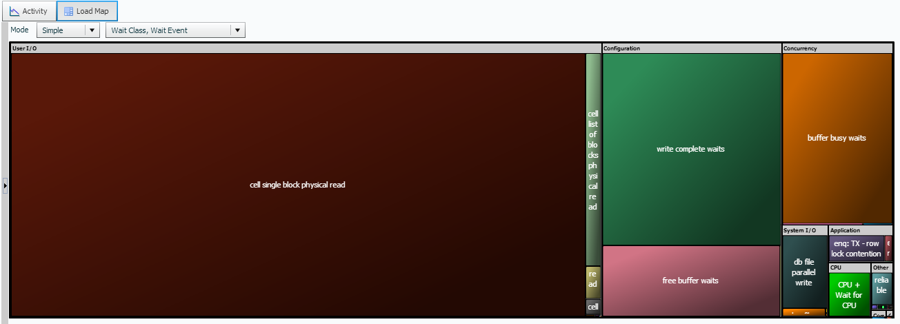
What is the benefit of the load map? Having different ways to visualize data can assist both the DBA, as well as developers and users understand it better. Where the graph of wait events may not make a huge impact for non-DBAs, the load map clearly shows the impact of the cell single block physical read in the above example.
What if we want to view ASH data, back to a graph, but by SQL_ID?
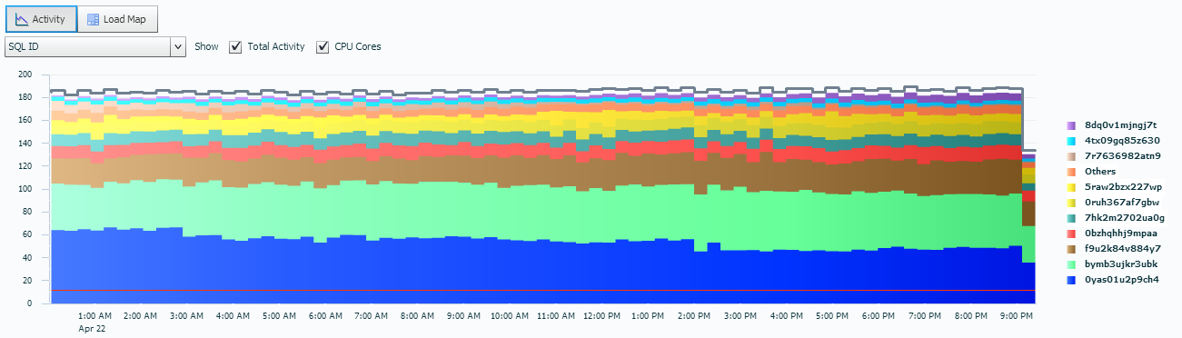
Your whole outlook on the statements causing the cell single block physical reads change once you change to this view, doesn’t it? The focus is now on the amount of active sessions on different SQL_IDs and not the actual wait events. You wouldn’t really want to use this view for an optimization exercise, but to know what percentage of sessions are actively executing what SQL is of interest.
Now what if we switch from the graph at the top to the data display at the bottom? We leave it at it’s default setting of SQL_ID as well, but now we can easily see the percentage of active sessions that are part of the graph above.
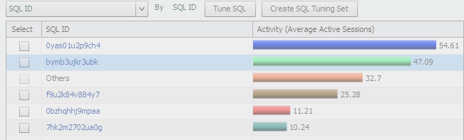
There is some consolidation after a certain percentage, so Oracle is quick to also let you know that over 32% is busy with “other” SQL… 🙂
Now we flip back to our graph area again. This time, we’ve moved from the SQL_ID that is running to the Top Levevl SQL_ID:
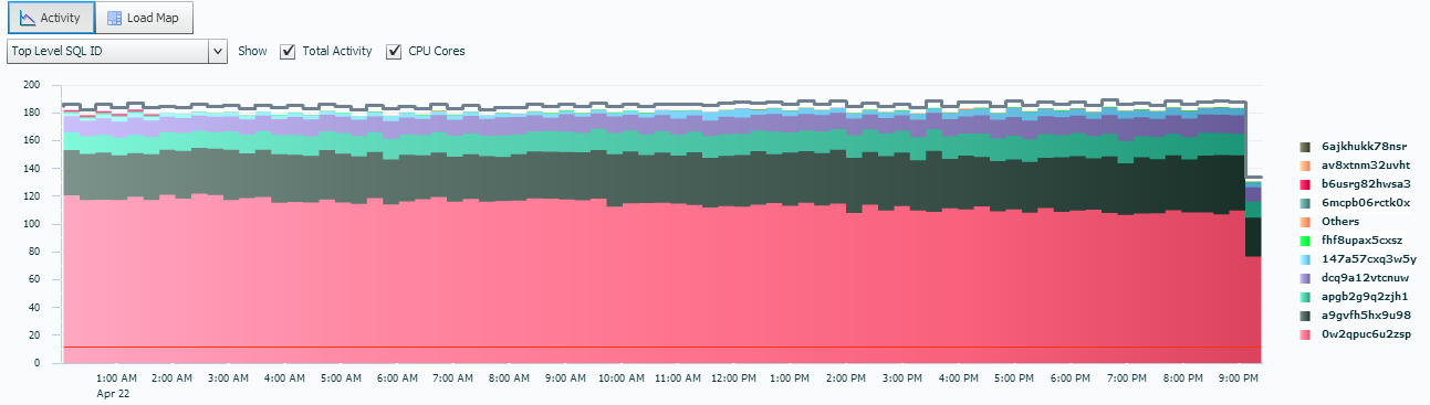
Notice the quantity involved in our active sessions has decreased significantly and the one, displayed in salmon, (I know, I know, 1/2 my readers just said, “what color is salmon??” Lighter red for you guys that have only six colors in your palette… :)) is the one we are going to focus on for optimization or issues.
If we filter a bit more in the lower section, while our graph is set to Top Level SQL ID, we set our lower left table to SQL ID. This allows us to quickly view what SQL_ID’s are associated with what Top Level SQL ID’s.
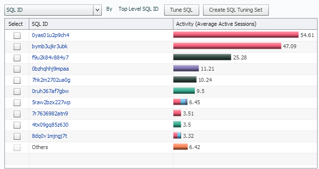
Notice that some of the statements are involved in more than ONE Top Level SQL_ID, but that two SQL_IDs in particular are involved in the majority of the activity.
Enough with SQL_IDs and Top Level SQL_IDs for a while, let’s dig down into some information about PL/SQL that is important when wanting to step through and understand workload. Returning our upper graph to Wait Class, let’s now filter our lower left graph by PL/SQL:
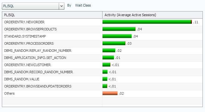
Note that our procedural calls are clearly displayed and the limited amount of CPU that is consumed by them are shown.
But now I want to know what is eating up all my IO, so leaving the upper graph on Wait Class, I switch the left graph to Object and the right graph to Module:
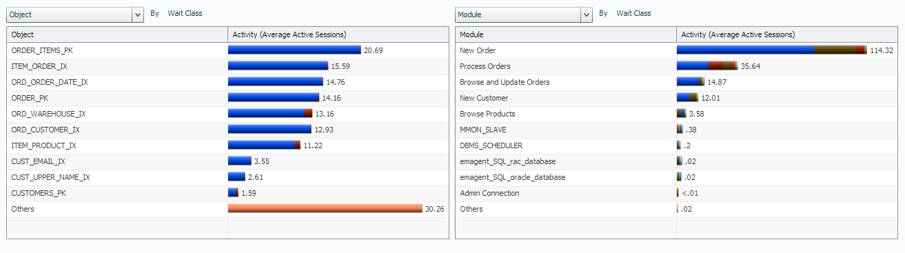
From this view, I can see what objects are clearly consuming the most IO by far on the left and on the right, I can see the module involved. You can view how index IO usage is extremely high and that the New Order and Process Orders modules are involved in a majority of the IO consumed, along with a bit of concurrency and application waits.
We can also switch these tables again to display back to the SQL_ID, but this time, I want to get a quick, high level look at the SQL Plan Hash Values. These should be pretty close to one-for-one from one side to the other, (same plan hash value will be consuming the same resources as the same SQL_ID for each row…) And as we see here, it is very much so:
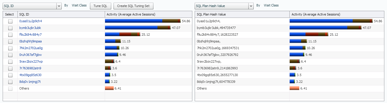
If the there were plan hash changes on my top SQL, we would see it on the right side, as it would then filter that SQL_ID/plan hash value to another row and take it’s percentage of resource usage with it…
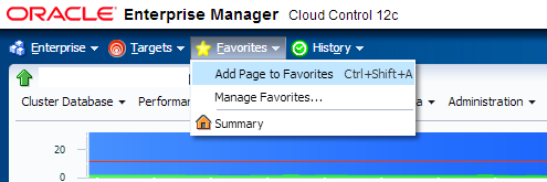
Now if you find a view/combination you like here, there’s no need to continue to constantly set it up every time you login. Choose to save the page in your favorites and that way it will be available for you whenever you want to go to it:
Hopefully this post has been helpful in showing more ways that ASH Analytics data can be used in your everyday monitoring to answer questions or to perform quick analysis.