
I’m often present to overhear comments like the following when issues arise:
- I *think* someone changed something.
- I bet some DBA changed a parameter!
- I know <insert name of person on the bad list> is running that process I told him/her not to!
Making assumptions vs. having data is a good way to alienate peers, coworkers and customers.
There is a great feature in the EM12c that I’ve recommended that can easily answer the “What changed?” questions and deter folks from making so many assumptions about who’s guilty without any data to support the conclusion. It’s called the ADDM Compare Report.
The ADDM Compare Report is easy to access, but may require the installation of a set of views to populate the report in the EM console. If asked to install, simply ensure you are logged in as a Super Administrator to the console and as a user with AWR rights to install to the EM repository.
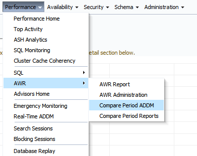
Once installed, you will return to the same access menu from the Performance menu in the database page to access the comparison:
Now lets give an example of why you might want to use this feature. In the following example, we can see that performance in this RAC environment has degraded significantly in a short period of time:
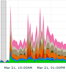
We can see from this snapshot from the EM Top Activity graph that performance has degraded significantly from about 9am with a significant issue with concurrency around 11am-12pm on March 21st.
Gather Information and Run the ADDM Compare Report
We then go to our ADDM Compare report and enter in the time for the comparison period that we are concerned about:
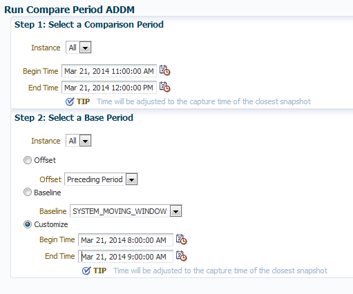
I’ve chosen a custom window for my base period, picking 8-9am, when performance was normal in Top Activity. If you receive an error, first thing to check is your date and times. It is very easy to mistakenly choose a wrong date or time. Also remember that as this is ADDM, it will work on AWR snapshots, so you must choose interval times, (1 hour by default) so depending on your interval for snapshots, no matter what time you enter, the ADDM Compare report will choose the closest snapshot to the time entered.
The High Level Comparison
The report will then be generated and the report will then be displayed.
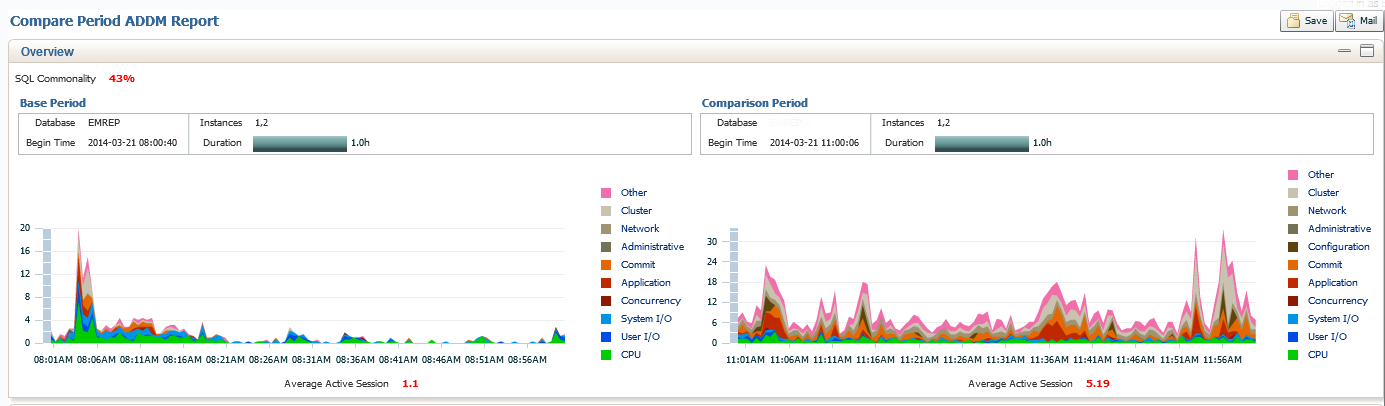
What we see in the top section of our report is a graph display of activity of our Base Period, (8-9am) vs. our Comparison Period, (11am-12pm). You can see a significant change in activity, but you can also see at the top left of the graph is the SQL Commonality is only 43%. This means that there is only 43% of the same SQL in the two times we are comparing. 57% is a large percent of difference to chase down, but we are aware, there were significant differences in what SQL was running in the base period vs. what ran during the comparison. Also note the Average Active Sessions, shown in red at the bottom center of our example. The Comparison Period has 5.19 on average, which is significantly more than the Base Period.
It’s All in the Details
The default in the second section of the report is the Configuration. This is where you would quickly discern if there were any changes to parameters, memory, etc. that are global to the database system.
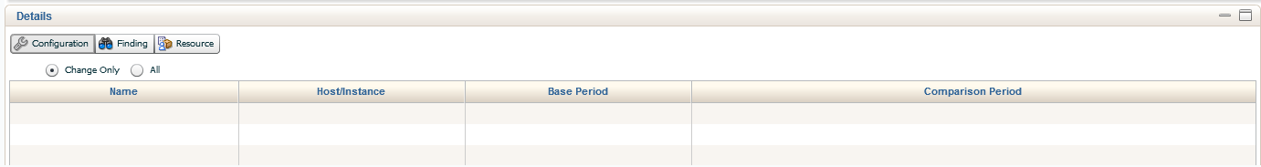
As you can see, our example had no changes to any global settings, including parameters, etc. If you would like to inspect the current settings, you can click on the All radio button and view everything.
The next step is to view the Findings for the report. Depending on your report, you will have different data that will show in the Performance Differences column. In this example, we’ll go over a couple examples and what you should look for, expand upon, etc. to give you the most from this feature.
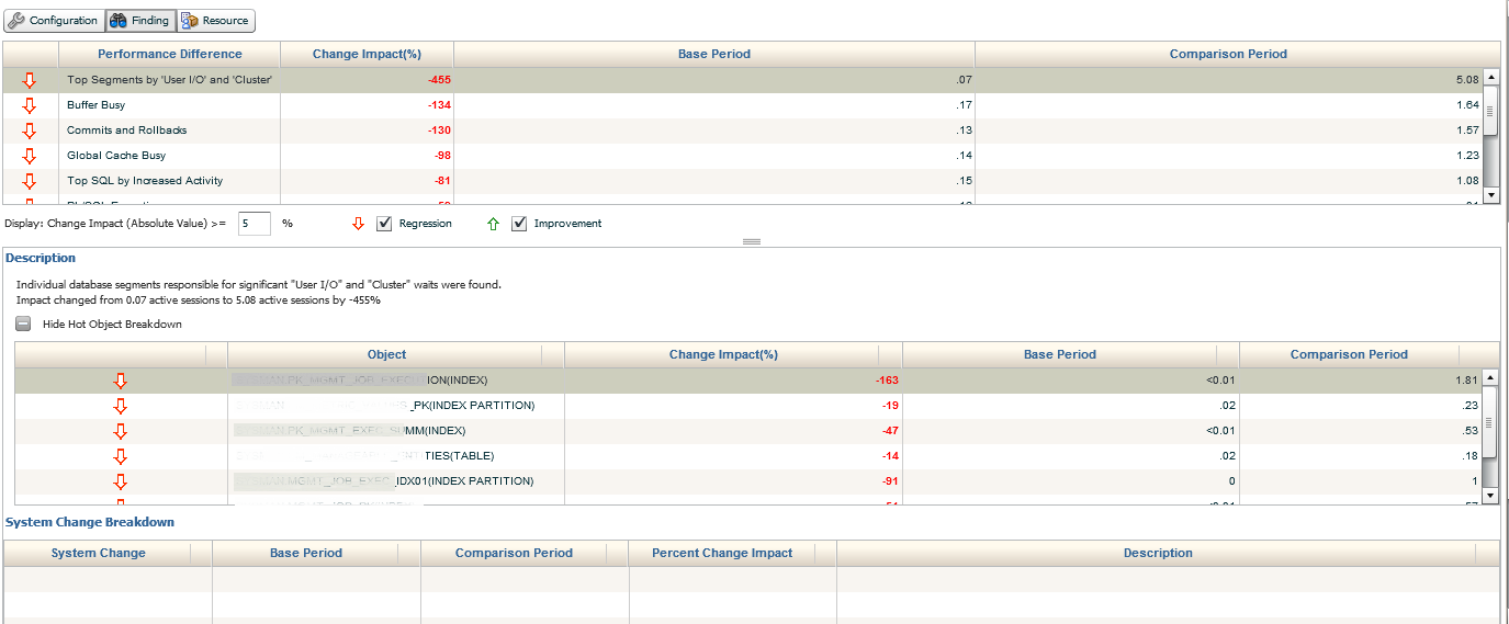
This section of the report is broken down by two or three sections, sometimes requiring you to click on a + sign to expand into the section of the findings and/or use drop down arrows to extend the data detail. The first section displayed here shows the current segments causing significant increases in User IO in the comparison period. It is then calculated by Change Impact, Base Period and Comparison Period. This allows the user to quickly access the total impact, as well as see the exact percentage of impact to each of the periods.
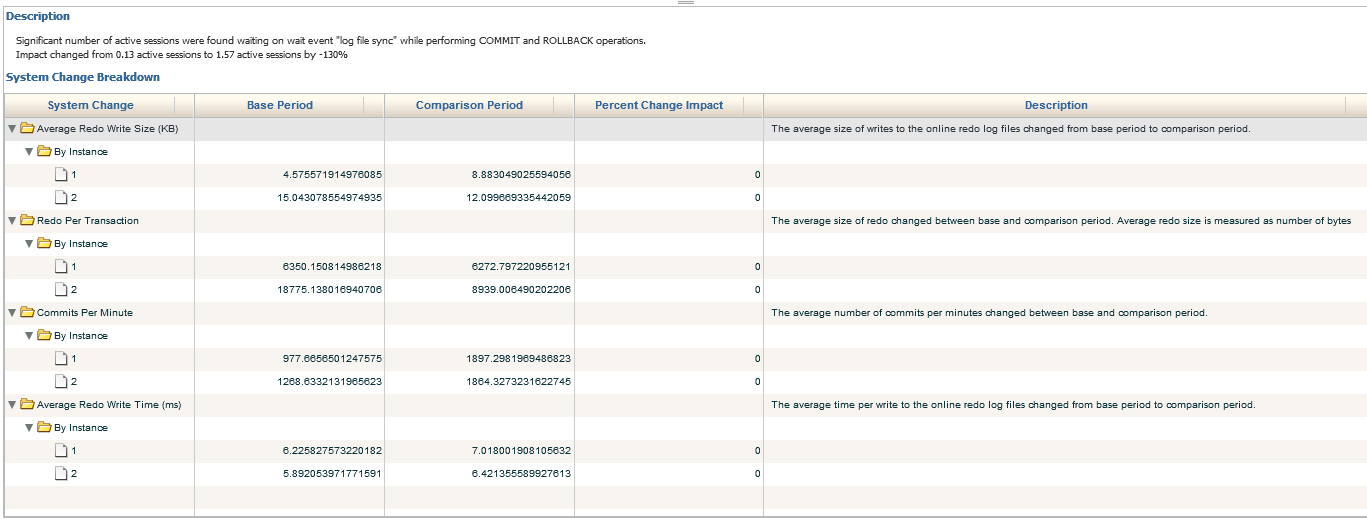
In the bottom section, if there were any global changes that were responsible for part of the impact, (System Change Breakdown) it will show for each one. As we see so far, only the difference to the average active sessions have caused concurrency, which has been directly responsible for the issue in performance degradation.
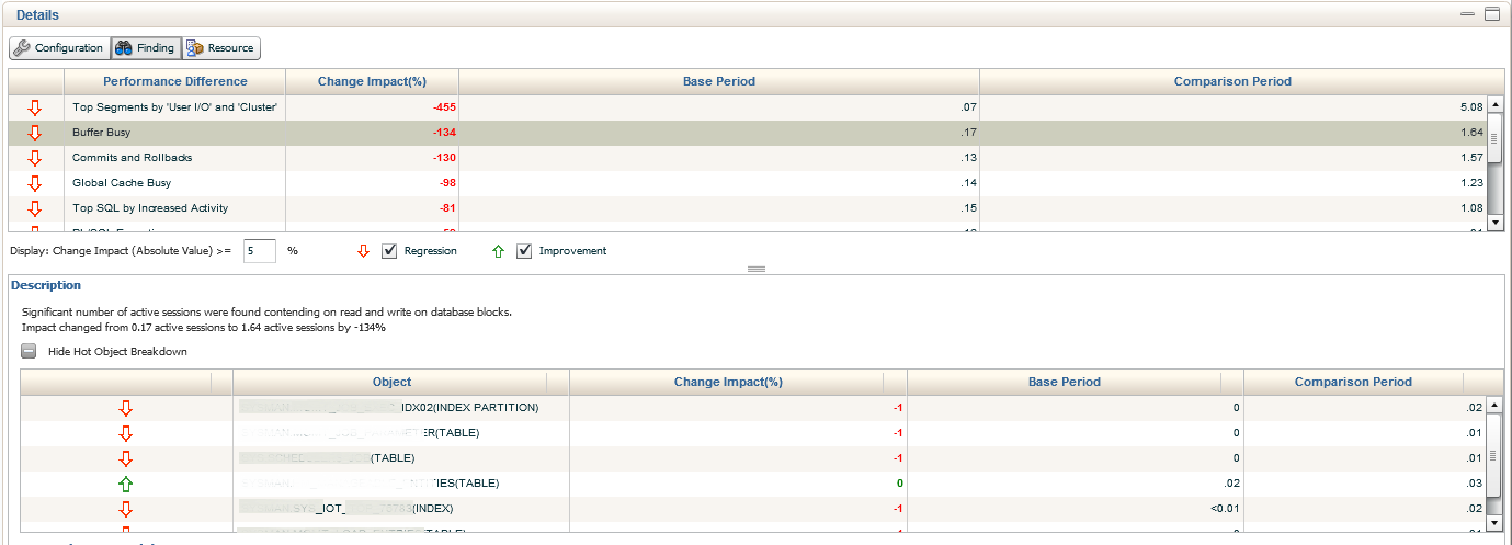
We’ll now move into the next section down, Buffer Busy waits. There is a significant decrease from the previous impact in the Change Period, (5.08% down to 1.64%) but we can still clearly see the increase from the Base Period, (.87% and .17%). We are able to extend the information provided by inspecting the bottom Description, which shows us each of the objects involved in the Buffer Busy Waits, percentage of Change Impact, the Base Period % and the Comparison Period %.
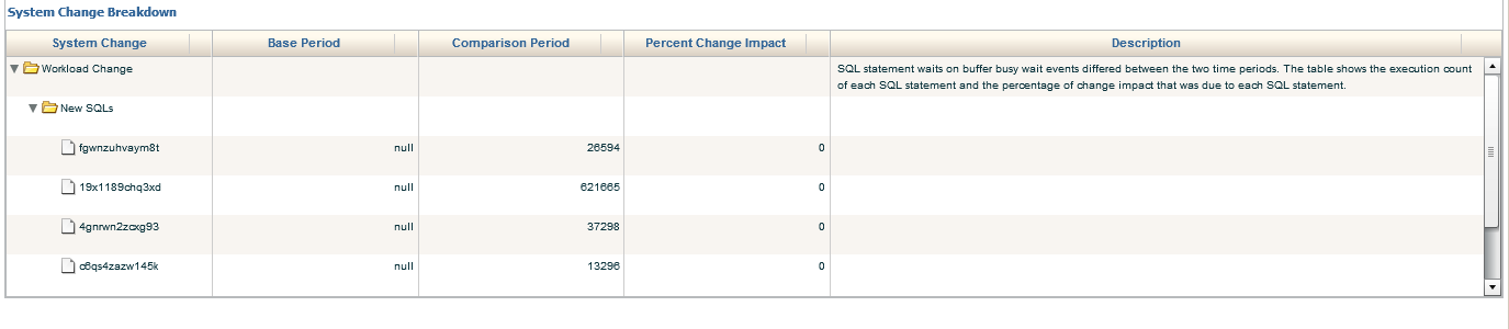
We can then drop down to the bottom of the report and dig into the System Change Breakdown. This includes the Workload Change, which we do see here and data is provided by SQL_ID. We see that the buffer busy wait was null for the Base Period, but contains values for the Comparison Period. The data may be a bit misleading as it shows 0% Percent Change Impact. The calculation for this report must have some type of value in the Base Period for it to function correctly, so take care when analyzing this part of the report.
System Changes in Workload
What you can do is hover your mouse over the SQL_ID and inspect the SQL statement.
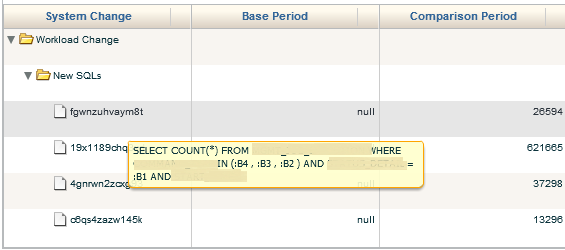
We can then …….
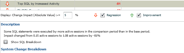
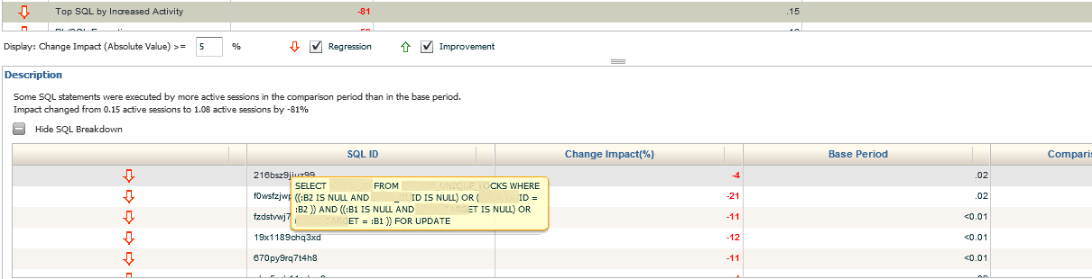
We also have the option to decide the percentage of changes we would like to inspect. the default is 5%, but if we want to look at less or more, we can update the value and so a search, then clicking on the + to show the SQL Breakdown. We can only display the Regression or Improvement information for any given section to filter as needed for the investigation.
Once into the SQL Breakdown, we can hover over any SQL_ID to display the SQL in question. We are able to see if the performance increased or degraded from the base period and the percentage of impact.
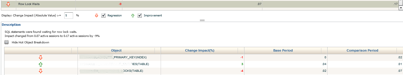
With each section displayed in the Performance Difference category, we then can go down to the description and view the data, (as we see below in the the table for Row Lock Waits). You can hide any area that is providing too much information for the inspection period, or filter what is displayed in the middle options area.
Resource Tab
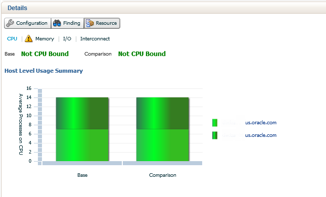
The final tab in the ADDM Compare Report is the Resource section. this is broken down into graphs that when any area is hovered over, display details about any given resource wait. The first section, highlighted in light blue is the CPU. Both the Base period and Comparison are noted to not be CPU bound. The CPU usage by instance is shown by varying shades of green for this two instance RAC environment.
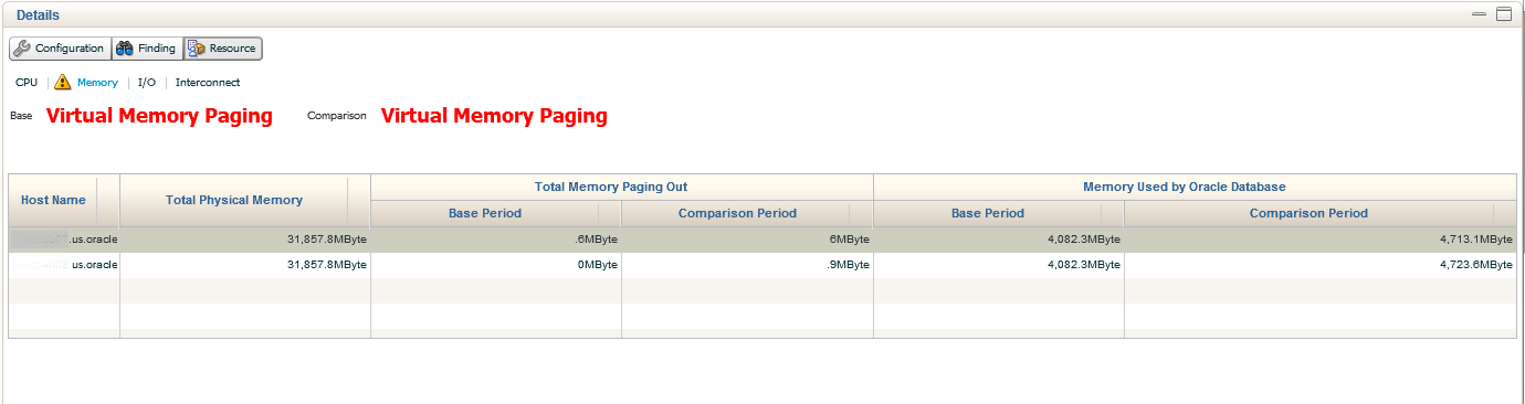
Second link in is for Memory. Both the Base and Comparison show that no virtual memory, (paging) was experienced. The amounts are displayed in a table format with totals.
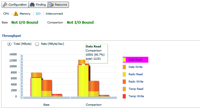
Our third Resource link is for I/O. There are more than one graph involved in this view, the first shows if in either period if I/O was an issue and then there is a break down of the type of I/O usage was seen in both. If you hover your mouse over any of the graph waits, such as Data Read in the example, you can see the the percentage and totals for the period is displayed. Note- Temp usage for read and writes are displayed in this section.
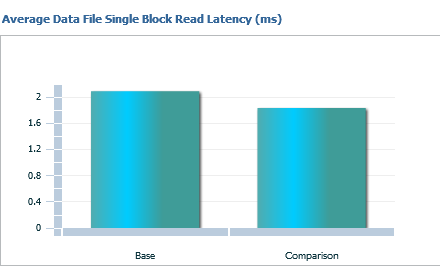
The right hand graph for I/O is all about Single Block Read Latency. This is helpful in many systems, but especially Exadatas, where single block reads can be especially painful. Note that this data is displayed by the base and comparison, by milliseconds and no instance filtering.
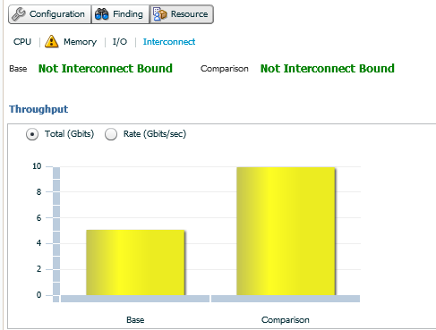
The last Resource link is for Interconnect. For RAC environments, this graph will display the base and comparison throughput in the left hand graph, along with if either period was Interconnect Bound. You can switch from the default display of GBit to GBit per second and remember, there won’t be any instance displayed, as this is the interconnect between the nodes on average.
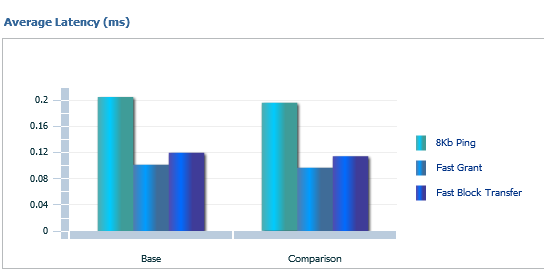
The right hand then displays Interconnect Latency. This is based off averages, displays graphs for 8KB pings, Fast Grant and Fast Block Transfer for the base and comparison period.
Now this data may make some DBAs scratch their heads on the value, so we’ll talk about this for just a minute and try not to make this blog post any longer than is already is… 🙂
8KB Ping– can be found via SQL*Plus via the DBA_HIST_INTERCONNECT_PINGS
The 8KB Ping is from the WAIT_8KB column and is a sum of the round-trip times for messages of size 8 KB from the INSTANCE_NUM to TARGET_INSTANCE since startup of the primary instance. Dividing by CNT_8KB, (another column) gives the average latency. So think of this as a bit about response across your interconnect.
Fast Grant- Cache fusion transfers in most cases are faster than disk access latencies , i.e. a single instance grant, so the Fast Grant is when the RAC environment experiences this and totals are averaged vs. how often a single instance grant is offered.
Fast Block Transfer– There are multiple situations that occur for block transfers, but this is displaying a percentage of only FAST block transfers experienced on average across the nodes of the RAC environment. Due to the fact that resolving contention for database blocks involves sending the blocks across the cluster interconnect, efficient inter-node messaging is the key to coordinating fast block transfers between nodes.
This calculation for the graph is dependent on three primary factors:
- The number of messages required for each synchronization sequence
- The frequency of synchronization– the less frequent, the better
- The latency, (i.e. speed) of inter-node communications
What the Report Told us About our Example
In the example we used today, the change had been the addition of 200+ targets monitored without the next step in tuning the OMS having been taken yet. As we were only seeing a change in the amounts of executions, weight to existing objects, etc., this was quickly addressed as the administrators of the system updated the OMS to handle the additional resource demands.
Summary
With all this data in one simple report, you’ll find that you can quickly diagnose and answer the question “What changed” without any assumptions required. The high-level data provided answers the often quick conclusions that can send a group of highly skilled technical folks in the wrong direction.
Let’s be honest- not having a map on a road trip really is asking to wander aimlessly.

Kellyn:
We find it completely unfair and downright wrong that, in recent weeks, you have felt compelled to produce such a sheer quantity of high quality blog entries about AWR/ADDM/ASH/etc deep diagnostics capabilities within Oracle EM12c.
We can only assume you realize that there are many of us who feel the need to drop whatever we are doing, no matter how important those tasks may be, and read your posts at least twice before we are satisfied that we have absorbed at least half of what you’ve covered.
Thank you for these incredibly useful deep-dives in EM12c features and functionality.
I wonder if there is a way to produce such Compare ADDM report without using OEM 12c, by executing it directly from database?