
OMS and OMR Performance- Part III, Metrics Page
Before heading off to UKOUG’s Tech 14 conference, thought I would jump back from the Agents performance page and look into the very important page in the Oracle Management Service, (OMS) and Oracle Management Repository, (OMR) regarding metrics. Standard metrics collection is demanding in itself, so when we add plugins, metric extensions and manual metric collection changes, it’s important to know how these changes can impact the performance of the Enterprise Manager 12c, (EM12c) Cloud Control environment.
We have returned to the same location in the EM12c console page: Setup–>Manage Cloud Control –> Repository. The Repository Page through three tabs, which we’re currently working with the middle tab, Metrics.
Metric Collections and Rows via Bubble Map
We’ll jump into the first graph, which is a fantastic bubble graph, (love seeing us use these more in EM12c console pages!)
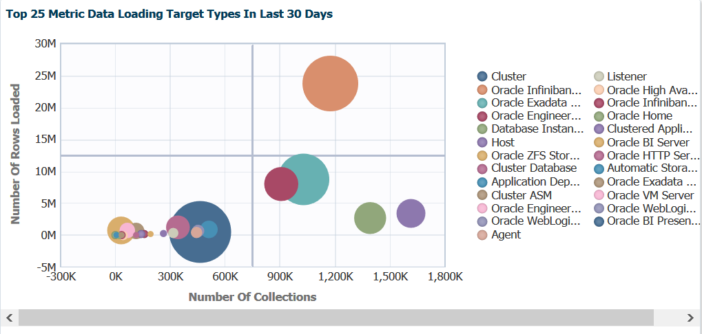
Note the data is distributed across the graph by the left side, Number of Rows Loaded vs. bottom, Number of Collections. This information is important as we note that our heaviest hitters are the blue and the orange circles. If we hover our mouse over the blue circle, we then get to see a few more details:
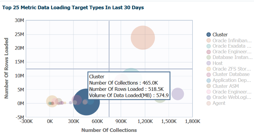
We now can see that the blue circle is the metric collections for cluster information and can see not just the two graphing points, but the amount of data in MB loaded. We can use this information to make decisions on updating collections intervals to ease stress on the EM12c OMS and OMR.
If we then focus on the orange circle, we can view the same type of detail information:
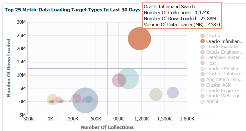
So there are a number more collections on the infiniband. This is expected, as this is the network connectivity between our nodes on the engineered systems. The amount of rows are higher, too, but note that the MB of data is no more than what the EM12c had to handle for the cluster data being uploaded. We can use this data to see if the collection interval pressure justifies the impact to the OMS and OMR. As we work through the rest of the data offered on this page, these are two important pain points to keep in the back of our mind regarding metric data uploaded vs. number of collections.
Investigating Bubble Map Performance Data
Now lets say we want to dig deeper into the inifiniband metric info that’s been shown here. We can double click on the orange circle in the graph and we’ll be taken to specific detail regarding this one metric and how target and metric details.
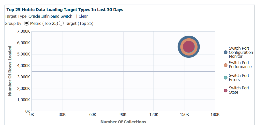
Now we see the top 25 metrics data load information not just for the parent metric target type, but broken down by metric specifics. We can quickly see that the Switch Port Configuration Monitor consists of the most metric data. As the data is compiled and uploaded as one collection, the bubbles are superimposed on top of each other.
If we switch to a Target view, a very different story is presented:
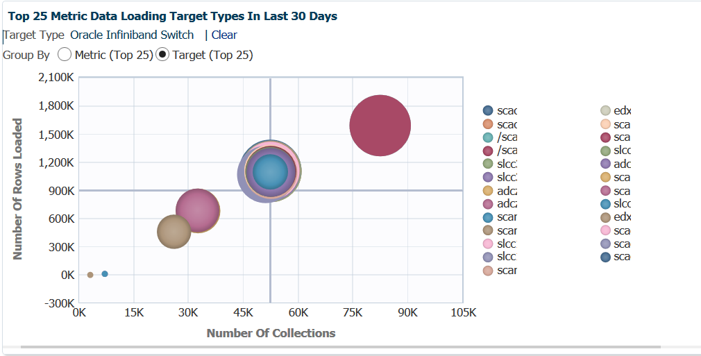
Note that six different collections interval schedules [most likely] displayed here. In the center, you can see the bubbled super-imposed on top of each other that are interconnected, but the large, red bubble is of significant interest. If we hover our cursor over this bubble:
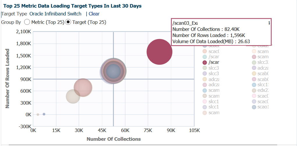
One scan listener, (scan listener 3 for an exalogic environment) is uploading more data and more often than the rest of the environment? This is over 26% of the total metric impact for infiniband on the EM12c. Investigating this, reviewing agent patch levels and comparing collection intervals would be a good idea!
Classic View of Metric Data
For those that prefer a more standard graph of the data, the right side graph displays the high level data in just a second format:
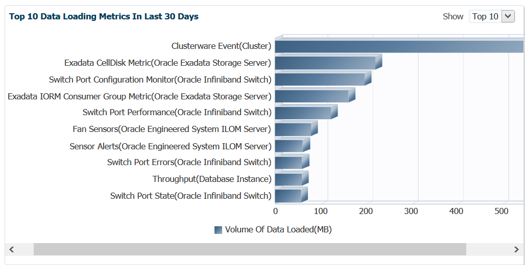
You also have the option, instead of the top 10, to display 15 or 20 top metrics.
Metric Alerts Per Day
Awareness of metric alerts per day can be valuable, especially when there are OMS, OMR or agent patches missing! I can commonly look at this graph and tell quickly if there an environment has skipped applying important EM12c patches, (can be located in the master note Enterprise Manager Base Platform (All Releases) (Doc ID 822485.1))
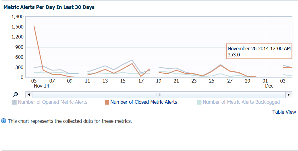
Now you see the breaks in the graph and may wonder what’s up with that- this environment has been patched and down for quarterly maintenance. We can see this when we click on the Table View link and see the Unavailable sections:
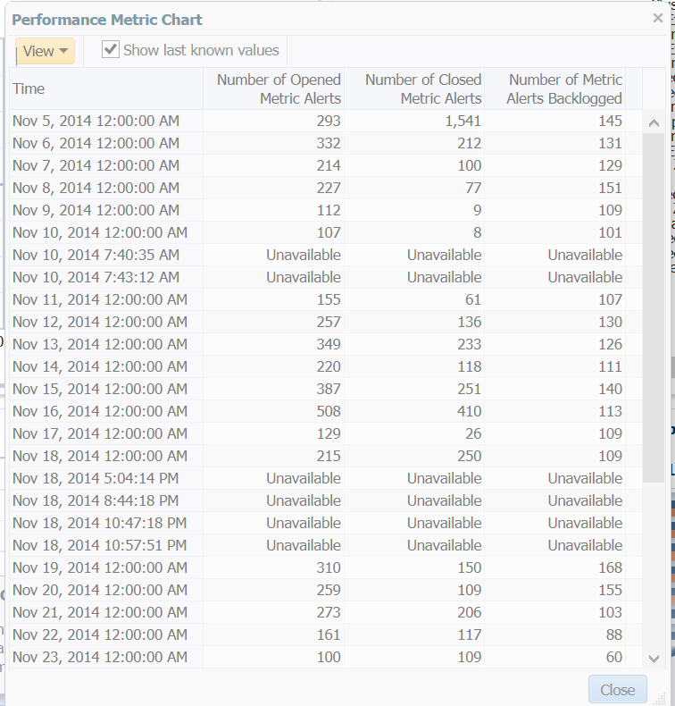
This also gives you quick access to the recent, raw data without having to query the MGMT$EVENTS view in the OMR directly or using EM CLI. Once we close this view, we can go back and highlight the different links below the graph to show advanced options.
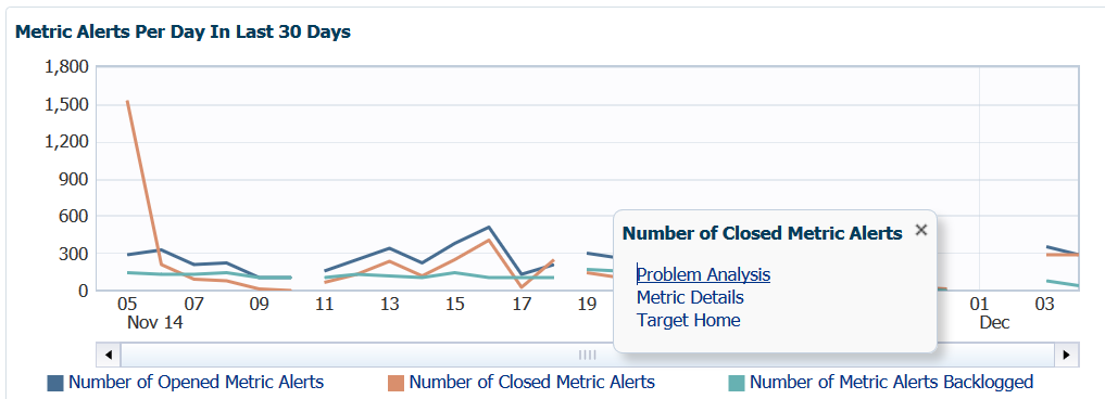
For the Opened, Closed and Backlogged Metric Alerts, we can view Problem Analysis, Metrics Detail or go to the Target home for this metric data. This is so cool that I’m going to do a separate blog post to do it justice, so be patient on this topic… 🙂
Top Ten Metric Collection Errors
The last graph on this page is another one that can give away if patches are missing pretty quickly.
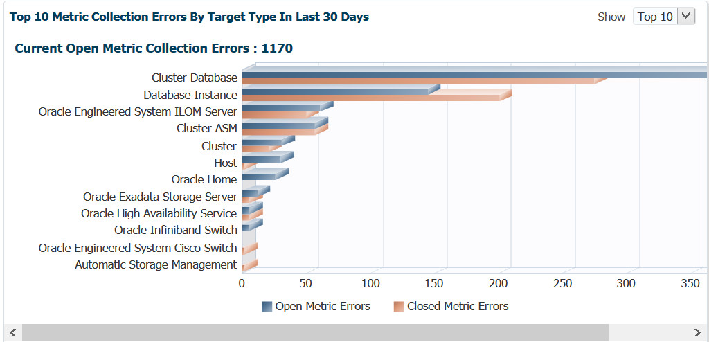
This is over 30 days, so if you are seeing 100’s of metric collections errors, you should first check to verify that there aren’t any patches that address metric collections of the type you are experiencing. If this isn’t the case- investigate the error messages for the collections in the MGMT$METRIC_ERROR_HISTORY view in the OMR. You can start with something as simple as:
SELECT TARGET_NAME, METRIC_NAME, COLL_NAME, ERROR_MESSAGE
FROM MGMT$METRIC_ERROR_HISTORY
WHERE ERROR_TYPE='ERROR'
AND COLLECTION_TIMESTAMP >=sysdate-30;
There is still a lot to cover in this series, but now it’s time to get ready for head over to Liverpool, England next week!