ASH Analytics- Activity Focused on Session Identifiers, Part III
We’re going to continue onto Session Identifiers in the ASH Analytics Activity view. You can use the links to view Part I and Part II to catch up on the ASH Analytics fun! Knowing just how many ways you can break down ASH data is very helpful when you are chasing an issue and need specific data to resolve it. We’ve already taken a deeper look into SQL and Resource Consumption, so not onto the session identifiers.
Session identifiers in ASH Analytics cover the following-

A session identifier provides distinct information about the session or sessions. Like previous blog posts, all data for each graph is from the same timeline, so comparisons to more readily understand the differences in data has been chosen.
Instance
The data is broken down by total sessions per instance, which is extremely helpful when working in a RAC environment. The graph will show if there is “weight” to the database resource consumption or unusual sessions, etc. from one instance or another.
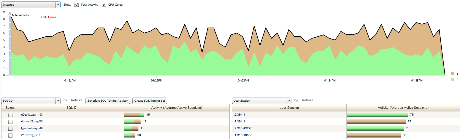
As you can see in our example, it’s pretty much 50/50 between the two, with a couple, minimal spikes from sessions that we can drill down on the right or by SQL_ID on the left. Notice that you can see the percentage of SQL that is being executed on each of the instances.
Services
Your services are your connections into the database that each session is using. The database environment we are using for our example only has one distinct “user” service, which is shown in hot pink. If you have more, you can gauge the amount of resources, per user service that’s been deployed to each application/user group/host, etc.
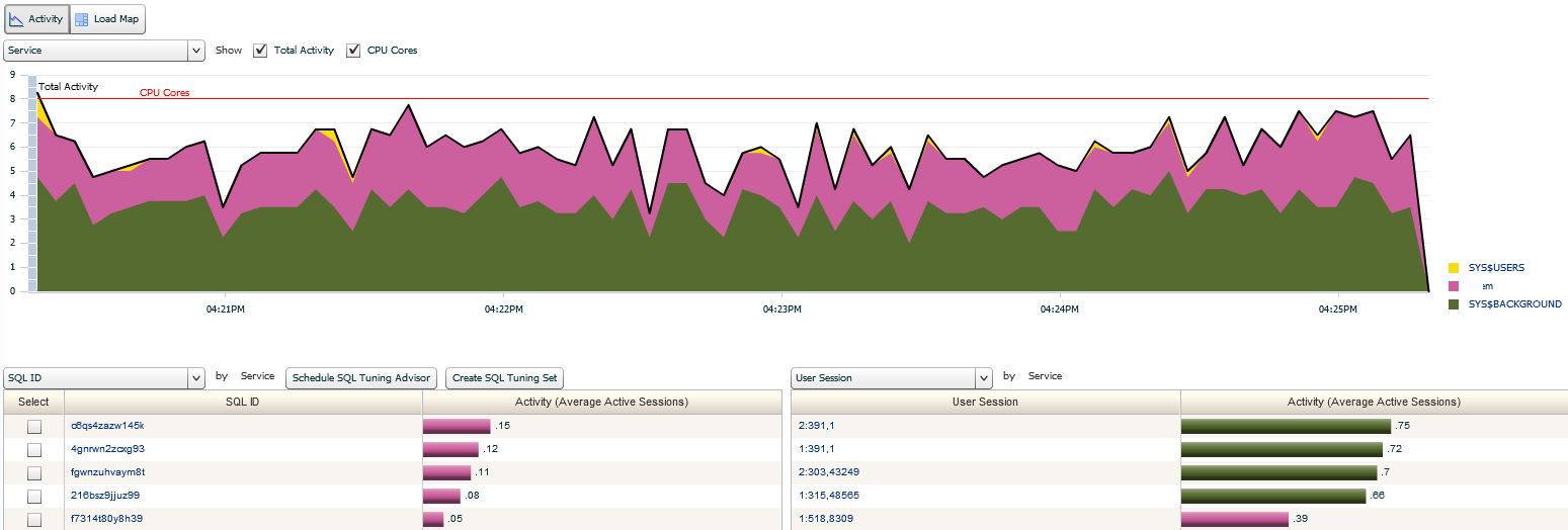
As we’ve seen in the other activity graphs, we can easily drill down by SQL_ID on the left or instance/SID/Serial# on the right.
User Session
The activity in this graph is quite heavy. We can identify the majority of user sessions that are consuming the highest amount of resources individually. The rest who can’t be isolated and graphed out individually, are then grouped at the bottom and marked as “Other”. This view comes in handy when you have one session that is an overall consumer that would be out of the norm.
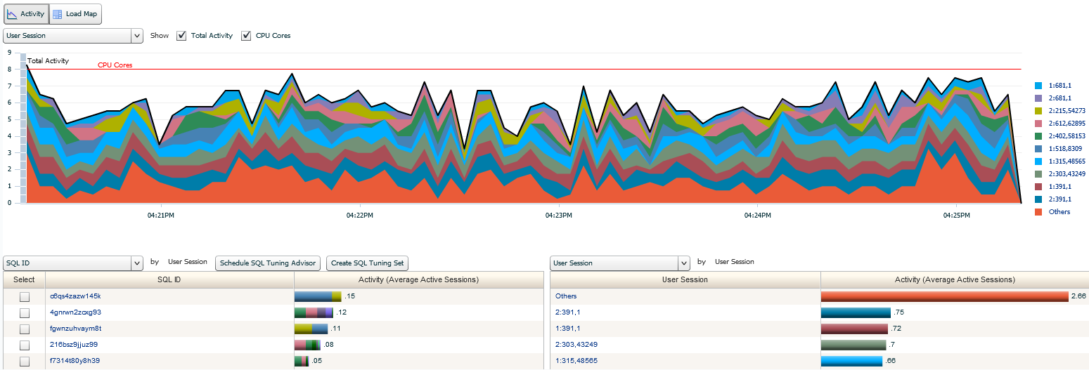
Notice the mix of sessions that are involved in each of the SQL_ID’s on the left. This tells us that most of the users are either accessing via an application or through packaged code. If you were to see one session running on top SQL_ID, this might be a reason to quickly investigate for an issue. The “Other” category may look interesting, but remember, if any one of these sessions or SQL_ID were a significant consumer of resources, they would have their own identified section in the graph. Don’t fall into the rabbit hole… 🙂
Parallel Processes
There isn’t a lot that I get to show you for activity here. The environment that I’m using for my example just isn’t set up to use or need a lot of parallel. I have all of two parallel processes and you can see a process running in parallel on the first instance and another on the second instance, identified by color.
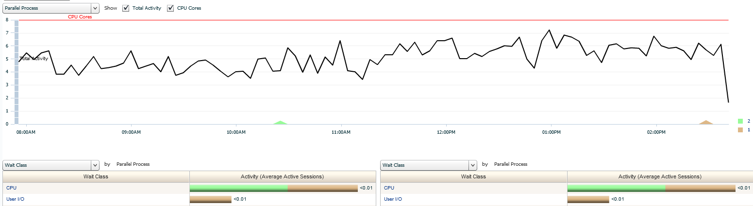
Notice that the bottom sections is our parallel process shown on both the left and the right side. You have the option to start filtering by more information, same as what you see at the top, but this is secondary filtering. A simple change on the right could gather a different set of data for the same processes, such as wait event or resource consumption.
User ID
As you can see, two primary User IDs are accessing the environment. We already know that its numerous sessions, but this could signify an application ID that is used for a login, resulting in the user login security being housed at the application or OS level. We can see that the primary usage is from the User ID with the magenta graphed section.
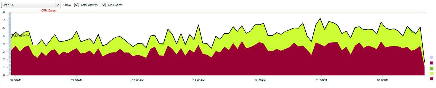
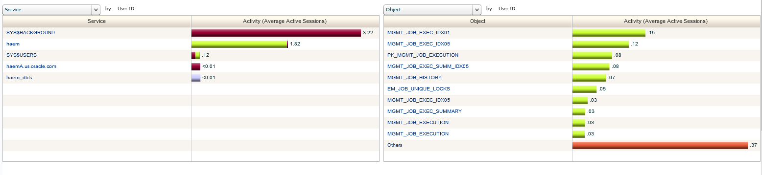
The bottom section would show the same as the top, just broken down by percentage. What we can do instead, is break it down by a different type of data, such as wait event or even objects as I’ve shown here:
Program
For the Programs Activity graph, I’ve done something a bit more with the bottom section. As you can see in the graph, we have the programs displayed across the graphs and notice for this one, the OMS is the majority of the usage, which is expected, (this is an OMS environment…. :)) Now look at the bottom section-
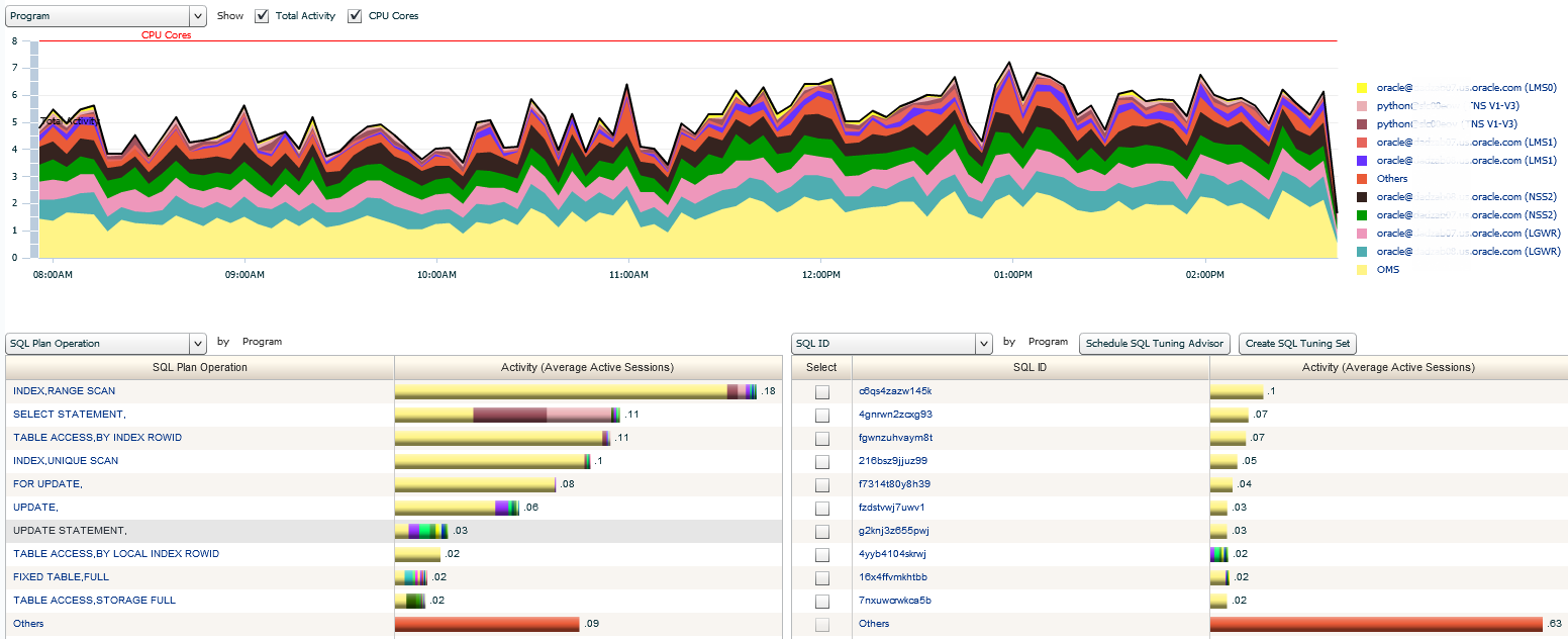
The default would have been to show me the Programs by percentage, but I’ve updated them by displaying now SQL information in the left and right sections. The left section, I’ve now requested to know what SQL Plan Operation there are and by what programs. The right I’m displaying the SQL_ID’s and from what Programs they are sourcing from.
Session Type
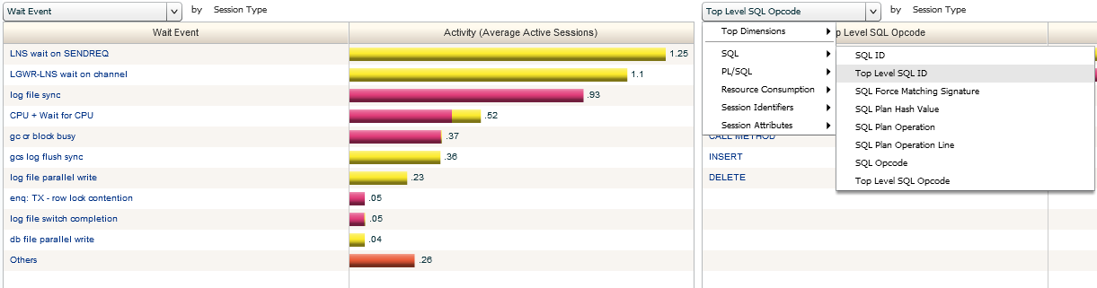
Last one is Session Type. This is to simply distinguish background vs. foreground processes. the bottom section already displays data on SQL_ID on the left and SID on the right. You’re welcome to mix up this data and filter anyway you need to, but this is the default for this activity view.
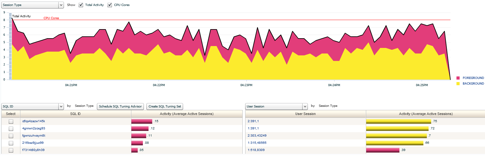
Keeping to our areas we’ve already discussed in our previous posts, I’ll switch up the left and break it down further by Wait Event. On the right, I’m just starting to choose a new filter, but notice that I’m simply clicking on the drop down menu and picking the event type I want to use for my new filter.
Using the activity graphs in ASH Analytics this way grants the DBA access to various types of diagnostic and analysis information that can be used to trouble shoot an issue or dig deeper into a performance tuning challenge when it comes to session information.