Ah, yes, it’s that RMOUG Training Days time of the year again!
As a techie, I didn’t put a lot of time into my slides when I first started presenting, thinking I’d simply dazzle them with my amazing knowledge.
What I found is that slide deck skills don’t just help your presentation, they help you tell the story better, which should be the goal of every presenter. No matter how technical we are, we most likely haven’t had any formal Powerpoint training and as I’ve been upping my “PPT skills” this last year, I thought I’d share with the rest of the class…:)
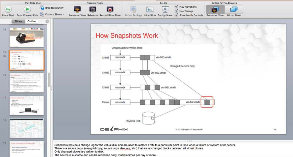
Presenter View
Presenter View something that would have really helped me out when I first started. To not have to remember every little detail and to have my notes displayed at the bottom of my screen would have been a stellar advancement.
Having notes at the bottom upped my presentation game, as I found I removed much of the text on my slides and instead used reference links to blog posts, articles and white papers to fully engage the attendee in my sessions vs. receiving minimal thoughts displayed on a slide.
I found that I went to more full screen graphics with a single phrase and was able to simply talk with the audience, having my notes keep me on topic, without having a slide full of discussion points that were more for me than those in attendance
Animations
A picture is worth a thousand words, but a moving picture? That’s a whole story and the reason people go to movies, watch TV and why even adults like cartoons. We can display an idea with movement more completely than a still image.
Powerpoint makes animations quite simple and it just takes the ability to group, highlight and animate with the animation toolbar:
All the basic and even a number of advanced animations are available to make your presentations pop and the ability to create a complex animation to get your point across!
Full Screen Graphics
Why is it great to have every other or every third slide a full screen graphic? It gives the audience a rest between the data they’ve been taking in and with technical or complex topic presentations, your attendee is likely to appreciate the break.
No matter if you’ve just discussed the algorithm used for a specific data masking feature or like the slide above, discussing networking for geeky introverts, a slide like this makes an impact and the audience will more likely remember intricate details when combined with a humorous phrase and memorable picture.
Always use stock images and if you end up using an image from someone else’s site, etc. ask and give credit.
Layout
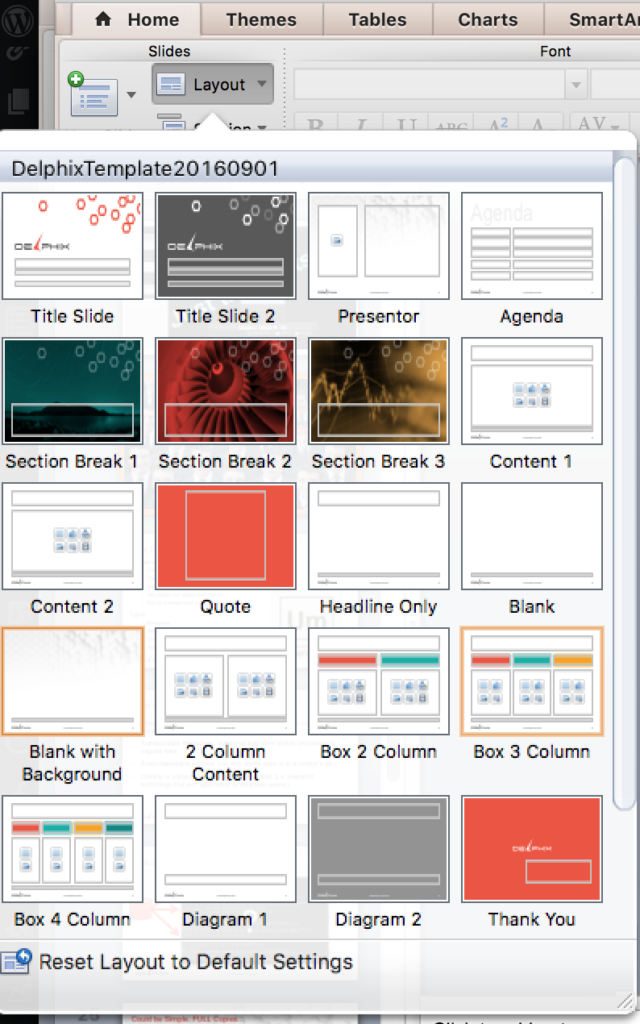
I used to update all my slides to a new template by copying them over in slide view, but now I know that I can switch them to a new slide template and switch out individual slides to new single template slides with the Layout menu in Powerpoint.
Having more control about the layout- everything from text, to graphics, etc. saves me time from manually updating everything in a single slide. If there is a common format that you use, you can make a copy of the template and save it off to use in the future, too.
Well, it’s time for me to get more tasks in preparation for the conference done! We’re looking forward to seeing everyone at RMOUG Training Days 2017!
Conference Sessions:
Wednesday: Introduction for Connor McDonald from Oracle, 2017 Keynote- 9:45am, Main Ballroom
Lunch with the Experts- 12:30pm, Main Ballroom
Women in Technology Round Table with Komal Goyal and Rene Antunez– 1:15pm, room 1A
Social Media, the Next Generation with Rene Antunez– 4pm, room 1A
Welcome Reception Host- 5:30pm in the Main Ballroom
Thursday: Delphix Hands on Lab- 9:00am in the OTN Area
Lunch with the Experts– 12:30pm, Main Ballroom
Closing Session for the OTN Area– 2:00pm
Virtualization and the Cloud– 4:00pm- room 4F
I will be found at the Registration Desk, the OTN area doing interviews, taking pictures and videos throughout the other times of the conference!
