I just finished cleaning up the example data that I was offered for my own demos and solutions. Working in Education requires you use education data to ensure what you’re presenting resonates with the users you’re working with. Otherwise you just look silly presenting something that makes utterly no sense to the individual you’re hoping to impress.
Having been given the gift a large data set from demos and solutions, I quickly took the data in its original form and attempted to use it, “as is” in Power BI. After a less than stellar demonstration, set off by bizarre results in my visuals, I chalked it up to my lack of experience with Power BI. Upon research, a different culprit appeared- incomplete, inaacurate and After all my years as a DBA, I should have known that it always goes back to the data. If you don’t have clean data and a clean data model, forget it. You’re just wasting your time.
Power BI is incredibly easy to use and a robust analytics tool, but if your data is rubbish, well, even its going to fail to give you the results you hoped for. Lucky for all of us, even when working with large data sets, it can help you identify problems in the data quality. I benefited from this as I tried to identify what had gone wrong with my new demo.
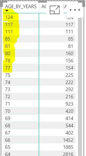
Its easy to assume that its your lack of affinity with the product when something trips you up, so I recreated the visual on college students by age and gender:
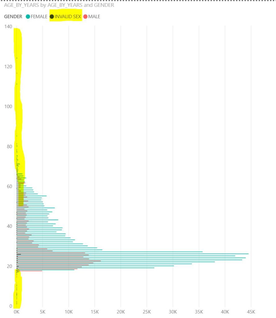
Upon viewing and sorting the students ages and counts, I realized the data contained discrepencies. There were some students with ages as young as 1 and as old as 124. I could understand daycare numbers having been mistakenly included into the student data, but a 124 yr old student?
I proceeded to inspect each of my visuals and any discrepancies resulted in me viewing the data and sorting it. If located, I was able to quickly cleanse the data, replacing the values with more representative values for age in my synthetic data set.
There were also three gender values listed:
- Male
- Female
- Invalid Sex
I could assume that there wasn’t any data for these students, but I also approve of full diversity and inclusion in my data and know that my company would approve. To add this representation for those that may not identify as cisgender, I updated all those populated with “Invalid Sex” to “Other”.
This resulted in a more reasonable and believable example data set and demonstrations:
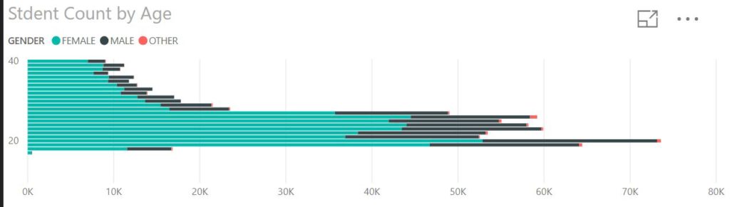
Although I still feel the ratio for male vs. female students is a little off from average, (70% women, 30% men) the data is looking much cleaner and I feel I’m getting closer to a standard data set that we can use for POCs, trials and for my own demonstrations.
The moral of the story is- always know your data and if you don’t, it should be the first thing you inspect when something is questionable.